Freelancer: HallidayBooks
Kongsi:
Laporkan Entri

App updates ...

Thank you again for the feedback and the advice regarding colour ways. This submission previews a selection using a crisp flat shadow - the darker area I believe should be the overlap of the two objects shadows. Regards Nick
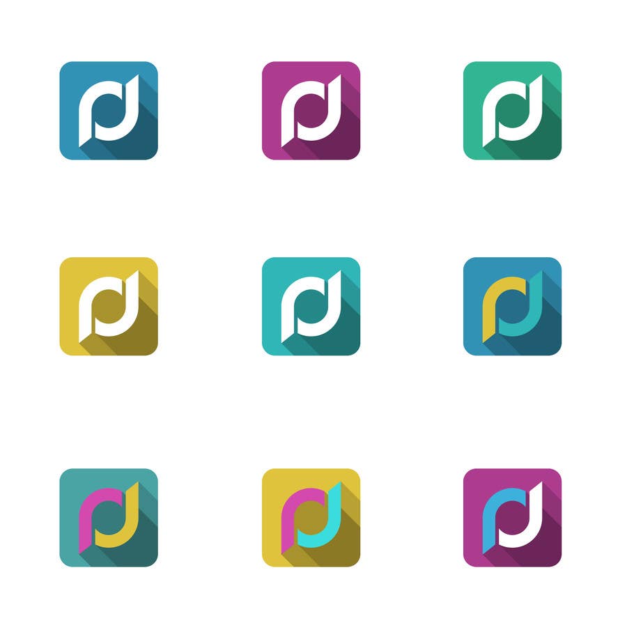
Penyertaan Peraduan #428 untuk                                                 Design a Logo for a Digital Goods Marketplace called Upando

Papan Penjelasan Umum

  • lohrad
    Penganjur Peraduan
    • 10 tahun yang lalu

    Hi, there! This is coming into an interesting way.. It`s almost there, but I believe it will need 2-4 interactions to be perfect.
    Feedbacks: I haven't liked this concept of sobrepositions of shadows.. (but the shadows tones are great)
    So, please do this:
    1. I haven't liked the shadow in the upper right corner more lighter... Let it at the same tone of the middle shadow like I drawed.
    2. Considering all color variations. I only did not liked the sky blue in the 7th one(together with purple and yellow)

    • 10 tahun yang lalu
    1. lohrad
      Penganjur Peraduan
      • 10 tahun yang lalu

      Oh and please reduce the box-radius to half or more. I like the "squared feeling" my drawing have.

      • 10 tahun yang lalu
    2. lohrad
      Penganjur Peraduan
      • 10 tahun yang lalu

      And please also consider what I wrote in this image: http://www.empremania.com.br/wp/wp-content/uploads/2013/11/logo_upando_sugestao3.png

      • 10 tahun yang lalu