Freelancer:
spotj
Third Pass
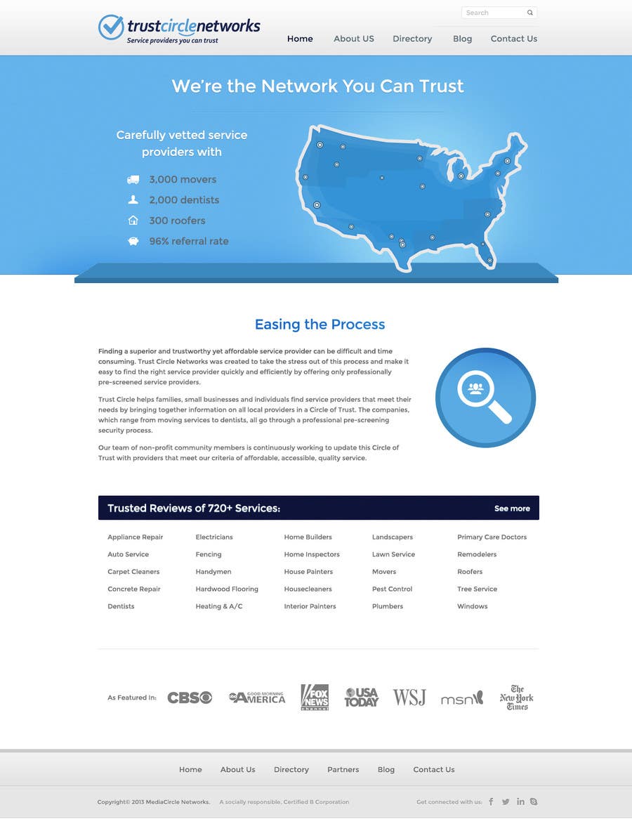
Removed the Open Resources and Mission sections. Updated to vector logo with tagline--I think the shorter tagline is more concise and fits the space better. Made the map smaller to not extend beyond the shelf. Also, I've attached two versions that deal with Easing the Process content section differently. The first one is different from the original, but on the second, I made the medallion smaller and moved it to the left side to make it play better with the map...there was too much visual weight to the right side of the page.


