Freelancer: veronicachyntia
Kongsi:
Laporkan Entri

option 1

hi there. heres my 1st entry. the icon of the logo is a mix betweeen L and D in lowercase hope you like it. it looks modern, and easy to remember. let me know what you think
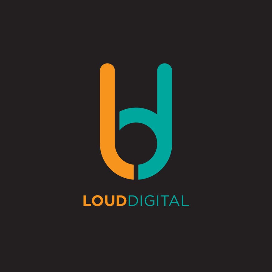
Penyertaan Peraduan #9 untuk                                                 Design a Logo for Loud Digital

Papan Penjelasan Umum

  • designbox3
    designbox3
    • 9 tahun yang lalu

    http://www.logo-asia.com/images/logo_design/ld_logo.jpg

    • 9 tahun yang lalu
  • veronicachyntia
    veronicachyntia
    • 9 tahun yang lalu

    Hi there I didn't copy that.. i made it all from scratch I can gve u the file but yes it looks similar I agree.. sorry for this. The icon is made from L and D initials. Feel free to reject my designs . I'll upload more ideas later: ) thank-you

    • 9 tahun yang lalu
  • farazsheikh360
    farazsheikh360
    • 9 tahun yang lalu

    http://www.logo-asia.com/images/logo_design/ld_logo.jpg
    Very much similar or it's a copy.

    • 9 tahun yang lalu
  • veronicachyntia
    veronicachyntia
    • 9 tahun yang lalu

    anythin yuo want me to change? :) thanks so much

    • 9 tahun yang lalu