Design an infographic

  • Status: Closed
  • Hadiah: $50
  • Penyertaan Diterima: 7
  • Pemenang: DataTrueStoryDE

Ringkasan Peraduan

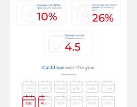
we need an infographic built that allows us to change numbers and replicate. We need two things done. One that shows the following information
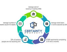
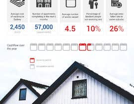
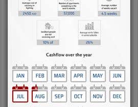
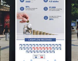
Average cost of vacancy in sydney 2450
Average number of weeks vacant 4.5 weeks
10% of landlord people are not receiving rent
57,000 apartments completing in th next 6 months
Average rents fallen in some suburbs by 26%

Then we also need a diagram that shows a cashflow over time

This will need to fit with the look and feel of our website and logo.

certaintyproperty.com.au

Kemahiran Disyorkan

Maklum Balas Majikan

“Great to work with understood the brief and made an effort to think not just follow.”

Gambar Profil speisley1, Australia.

Penyertaan teratas dari peraduan ini

Lihat Lebih Banyak Entri

Papan Penjelasan Umum

  • speisley1
    Penganjur Peraduan
    • 4 tahun yang lalu

    To further clarify we must be able to utilise in powerpoint/ word for chanegs. concept one and 2 do not need to be on the same page (so you have lots of room

    • 4 tahun yang lalu
    1. DataTrueStoryDE
      DataTrueStoryDE
      • 4 tahun yang lalu

      Once the A4 design finish based on your feedback it can be turned into number of PowerPoint slides accordingly. I don't think a Word version will be useful but it can be done.

      • 4 tahun yang lalu
  • speisley1
    Penganjur Peraduan
    • 4 tahun yang lalu

    Thank you for everyones entries so far they are good.

    • 4 tahun yang lalu
  • speisley1
    Penganjur Peraduan
    • 4 tahun yang lalu

    For those still wokring on entries please let me know I will not award a winner until I have received them all

    • 4 tahun yang lalu
  • sonugraphics01
    sonugraphics01
    • 4 tahun yang lalu

    Hi sir..Please wait until contest time end..i am working on your project.

    • 4 tahun yang lalu
  • himanshugarg2631
    himanshugarg2631
    • 4 tahun yang lalu

    The average cost of the vacancy in Sydney 2450. is it per month?

    • 4 tahun yang lalu
    1. speisley1
      Penganjur Peraduan
      • 4 tahun yang lalu

      yes

      • 4 tahun yang lalu
  • speisley1
    Penganjur Peraduan
    • 4 tahun yang lalu

    I want to be able to insert my own numbers

    • 4 tahun yang lalu
  • DataTrueStoryDE
    DataTrueStoryDE
    • 4 tahun yang lalu

    Can you provide the infographic title and the script you want to include.

    • 4 tahun yang lalu
  • DataTrueStoryDE
    DataTrueStoryDE
    • 4 tahun yang lalu

    So, the point of the cash flow chart over time is to show that property owner is going to face a 6 weeks of vacancy during the year, and here you guarantee a complete cash flow even if the property is empty.

    • 4 tahun yang lalu
    1. speisley1
      Penganjur Peraduan
      • 4 tahun yang lalu

      yes exactly correct. a calender us a nice idea

      • 4 tahun yang lalu
  • DataTrueStoryDE
    DataTrueStoryDE
    • 4 tahun yang lalu

    How about visualizing the gap using a 12 month calendar (no details, just icons), then mark 1.5 months.

    • 4 tahun yang lalu
    1. speisley1
      Penganjur Peraduan
      • 4 tahun yang lalu

      yep thats a good idea

      • 4 tahun yang lalu
  • speisley1
    Penganjur Peraduan
    • 4 tahun yang lalu

    it isn't a comparative chart it is more a statement of fact so there is not a time series but rather here are a series of facts. then the second set of graphics is here is a time series showing rent received over time with gaps where vacancies are

    • 4 tahun yang lalu
  • speisley1
    Penganjur Peraduan
    • 4 tahun yang lalu

    so what we want to say is here are a series of statistics . our business guarantees that these costs or issues won't happen.
    in the brief you will see there are two elements
    the first is the statistics and how these are represented.
    the second element is the cashflow over time if we applied a 12 month cashflow and during that period there was a time of vacancy of 6 weeks. so maybe show that over two years where there would be 2 periods

    • 4 tahun yang lalu
    1. DataTrueStoryDE
      DataTrueStoryDE
      • 4 tahun yang lalu

      Do you have a source for your data. anyway, I can't say I understand the cash flow diagram without numbers, maybe you can provide a better hand drawn draft.

      • 4 tahun yang lalu
  • speisley1
    Penganjur Peraduan
    • 4 tahun yang lalu

    the infographic will be used in A4 and PowerPoint.
    if. in terms of cashflow what we want to show is periods of occupation, then periods of vacancy and the impact this has

    • 4 tahun yang lalu
    1. DataTrueStoryDE
      DataTrueStoryDE
      • 4 tahun yang lalu

      OK, but please provide me with data for the cash flow chart. and if 10% of landlord people are not receiving rent, did the rate got higher compared to the past 3 years for example. we need statistics and comparison to view the impact.

      • 4 tahun yang lalu
  • speisley1
    Penganjur Peraduan
    • 4 tahun yang lalu

    so 2450 is per month

    • 4 tahun yang lalu
  • DataTrueStoryDE
    DataTrueStoryDE
    • 4 tahun yang lalu

    what size should the infographic be?

    • 4 tahun yang lalu
  • DataTrueStoryDE
    DataTrueStoryDE
    • 4 tahun yang lalu

    Please, provide the cashflow diagram numbers, to visualize and use the proper chart. you can also provide more comparison regarding the other data over time if available.

    • 4 tahun yang lalu

Tunjukkan lebih banyak komen

Bagaimana untuk mulakan dengan peraduan

  • Siarkan peraduan anda

    Siarkan Peraduan Anda Cepat dan mudah

  • Dapatkan berjuta penyertaan

    Dapatkan Bertan-tan Penyertaan Dari serata dunia

  • Anugerahkan penyertaan terbaik

    Anugerahkan penyertaan terbaik Muat turun fail - Mudah!

Siarkan Peraduan Sekarang atau Sertai kami Hari Ini!