Graphic Design for edition offenburg
- Status: Closed
- Hadiah: $100
- Penyertaan Diterima: 43
- Pemenang: Guxalin

Ringkasan Peraduan
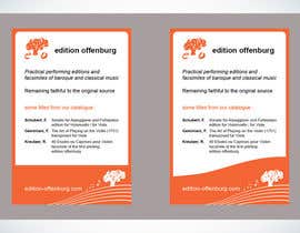
edition offenburg is a private publisher specialized in the printing of music of the 17th, 18th and early 19th centuries. Working from original manuscripts and first printings found in various archives, new editions or facsimile reproductions are created
Kemahiran Disyorkan
Maklum Balas Majikan
“Great work, I'm very happy with the results! Very professional.”
![]() Jul405, Germany.
Jul405, Germany.
Papan Penjelasan Umum
-

Guxalin
- 11 tahun yang lalu
Thank you so much!!
- 11 tahun yang lalu
-

Penganjur Peraduan - 11 tahun yang lalu
Thanks a lot to everyone who participated!
- 11 tahun yang lalu
Lihat 2 mesej lagi
-

neutron88
- 11 tahun yang lalu
Can any till me how to pass "Freelancer Orientation Test " :)
- 11 tahun yang lalu
-

nabeelkondotty
- 11 tahun yang lalu
just one suggestion, Please add the fallen "e" "o" leaves under the tree at the bottom.
regards,
Nabeel- 11 tahun yang lalu
-
nabeelkondotty
- 11 tahun yang lalu
@Guxalin , Congrats and keep going.
all the best
regards,
Nabeel- 11 tahun yang lalu
-
Guxalin
- 11 tahun yang lalu
Please check #12 and #13 Thank you.
- 11 tahun yang lalu
-

PPG9773
- 11 tahun yang lalu
It's not often clear that there are pms via our dashboard - so maybe they simply haven't found them. Guxalin - in your competitions dashboard look to the drop down menu and click on 'message' - you will find your private mesage board there. HTH. PS personally the notes look a little twee - try abstracting them a little.
- 11 tahun yang lalu
-
nabeelkondotty
- 11 tahun yang lalu
Anyway Guxalin... Congratz
- 11 tahun yang lalu
-

zhall
- 11 tahun yang lalu
pls check #47 , #48 , #49 , #50 sir..i hope you like it
- 11 tahun yang lalu
-
nabeelkondotty
- 11 tahun yang lalu
Hello sir,
Please kindly check my entries #22 - #28 . I have arranged the texts to be appearing in that small size. Nothing to talk more. Just see each one to feel the change between. The text alignment/size/arrangement.
Thanks- 11 tahun yang lalu
-
nabeelkondotty
- 11 tahun yang lalu
Will do it
- 11 tahun yang lalu
-
nabeelkondotty
- 11 tahun yang lalu
Border can be added to the one which you need. Thanks for your feedback. border color and thickness you can decide.
I use this style to keep the uniformity of your all works. And your work style should be followed always :)
Thanks- 11 tahun yang lalu
-
nabeelkondotty
- 11 tahun yang lalu
+ #36 , #37
Please kindly rate- 11 tahun yang lalu
-
nabeelkondotty
- 11 tahun yang lalu
Ready for Editting
- 11 tahun yang lalu
-
neutron88
- 11 tahun yang lalu
quality reduced due to conversion to a pic but i guess you would get the idea.
- 11 tahun yang lalu
-
PPG9773
- 11 tahun yang lalu
Ok so it's not conservative - but in a conservative magazine a little 'difference' may cause a lot of looks!
- 11 tahun yang lalu
-
Penganjur Peraduan - 11 tahun yang lalu
I agree, a little difference shouldn't be a show stopper. But to be honest #11 looks too bold and a bit tangled to me. Too many different effects like the tilted and the 3D logo, many different font sizes and weights...
- 11 tahun yang lalu
-
PPG9773
- 11 tahun yang lalu
Ok - I'll simplify. Thank you for taking the time to give feedback - it is most appreciated and a courtesy not often extended in these competitions.
- 11 tahun yang lalu
-
Penganjur Peraduan - 11 tahun yang lalu
in general, for the entries with a lot of white: I would prefer a border around the ad since its just a quarter page
- 11 tahun yang lalu
-

ArtsBrand
- 11 tahun yang lalu
Thanks for checking my entries; is there anything you'd like me to do to improve them further?
- 11 tahun yang lalu
-
nabeelkondotty
- 11 tahun yang lalu
#29
with
some more touches- 11 tahun yang lalu
-
nabeelkondotty
- 11 tahun yang lalu
My Entries : #22 , #23 , #24 , #25 , #26 , #27 , #28
Please have a glance through each one You will find the one you need. Please kindly rate these.
Thanks- 11 tahun yang lalu
-
ArtsBrand
- 11 tahun yang lalu
Hi Jul 405, do you want 'The Art of Playing on the Violin' to be italicised? Feels wrong for it not to be - I'm a cellist and a perfectionist!
- 11 tahun yang lalu
-

azkaik
- 11 tahun yang lalu
check the tree logo #8 ..how is that?
- 11 tahun yang lalu
-
Penganjur Peraduan - 11 tahun yang lalu
I've added the tree logo as a vector
- 11 tahun yang lalu
-
azkaik
- 11 tahun yang lalu
#5 is the edition offenburg in one line...:)
- 11 tahun yang lalu
-
azkaik
- 11 tahun yang lalu
hey check #4 i have added a vector and changed the style,,i think a little design will attract for people and make the add attractive ..tell me if you want it removed..:)
- 11 tahun yang lalu
-
azkaik
- 11 tahun yang lalu
i have used the ariel font and mentioned all what u said and did'nt added any vector etc.if you want to add details or change the font then tell me soon..:)
- 11 tahun yang lalu
-
Penganjur Peraduan - 11 tahun yang lalu
yes, the font is fine. I think i would prefer to have "edition offenburg" (it's with a u by the way) in one line though. If you have good ideas to make the ad look better with vectors feel free to do so...
- 11 tahun yang lalu
-
azkaik
- 11 tahun yang lalu
sure i'm making my effort hope u like :)
- 11 tahun yang lalu
-
azkaik
- 11 tahun yang lalu
would you like to tell something about #1 .any improvement or text alternation??
- 11 tahun yang lalu
-
Penganjur Peraduan - 11 tahun yang lalu
Thanks for the entries so far. Please note that the sketch doesn't have to be followed by no means - I've (tried) to put all the requirements in the brief itself. Full address can, but doesn't have to be included (just the URL is necessary).
- 11 tahun yang lalu
Bagaimana untuk mulakan dengan peraduan
-

Siarkan Peraduan Anda Cepat dan mudah
-

Dapatkan Bertan-tan Penyertaan Dari serata dunia
-

Anugerahkan penyertaan terbaik Muat turun fail - Mudah!