kayecandy
Philippines

This is a competition for the best re-design and re-implementation of the multi-selection checkboxes on our website.
*** PLEASE SUBMIT YOUR MOST CREATIVE SOLUTIONS *** WE ARE LOOKING FOR ORIGINAL VISUAL DESIGN AND STRONG UX ***
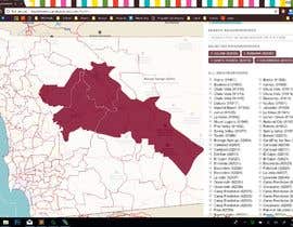
We have a regional website which serves one geographic area only. Currently we have an input form with 97 checkboxes corresponding to postal codes (zip) of the areas of service, divided into two groups, 9 checkboxes on top (which are near the company location) and the remaining 88 chekboxes in alphabetical order (very difficult for end-users who are not located near the top 9 choices).
The biggest problem we have with the current solution, is that the selection does not take into account the user's preferred location. We have hard-coded the company's location near the top of the search options as the first 9 choices, but this does not correspond to all users' locations. We need to make this more customer-centric and prioritize the checkboxes which are closest to the user, especially when the user is searching in a different location from the company's main location.
This means the first obstacle, is determining the user's location. THEREFORE, we need to ask the user their general location, before we can display the detailed location choices. ***ONE IDEA***: When the user has already selected 1 or more zipcodes, we would like the solution to automatically suggest or prioritize zipcodes which are nearest to those already entered. *** ANOTHER IDEA *** we could use the user's current location from their mobile device. *** IDEA #3*** take into account the geographic proximity between different zipcodes so that each location choice influences the remaining choices available. We have provided a map of zipcodes so that you can use that in the design.
*** PLEASE OPEN THE ATTACHMENT, THERE IS A VIDEO AND ADDITIONAL FILES ***
***Attachment***: https://drive.google.com/open?id=1KHe8fJehOEqv0RTc4Bc4_--nMXSb2Jsv
***Password***: 0N*RSGksuQqR
UPDATE:
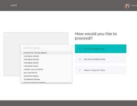
For this project, I am looking for very strong Visual Design with USER EXPERIENCE (UX) consideration. The submissions so far have been visually not very strong, and not very creative, and also not very user-friendly. Here is one idea I would like to explore: offer the user just 3 buttons at first (use current location, search entire area, or specify search area). If they specify a general search area, like city / suburb / coastal / rural, then the appropriate zipcodes from those sub-areas would be presented.
### DO NOT FORGET TO CHECK FOR CLARIFICATIONS IN THE PUBLIC CLARIFICATION BOARD ###
“all-around excellent work”
![]() afterhourstech, United States.
afterhourstech, United States.


Siarkan Peraduan Anda Cepat dan mudah

Dapatkan Bertan-tan Penyertaan Dari serata dunia

Anugerahkan penyertaan terbaik Muat turun fail - Mudah!
