Freelancer: itsatiflatif
Kongsi:
Laporkan Entri

Comparison for ODAPES

Hi sir, this is my new entry please guide if changes are required. thanks
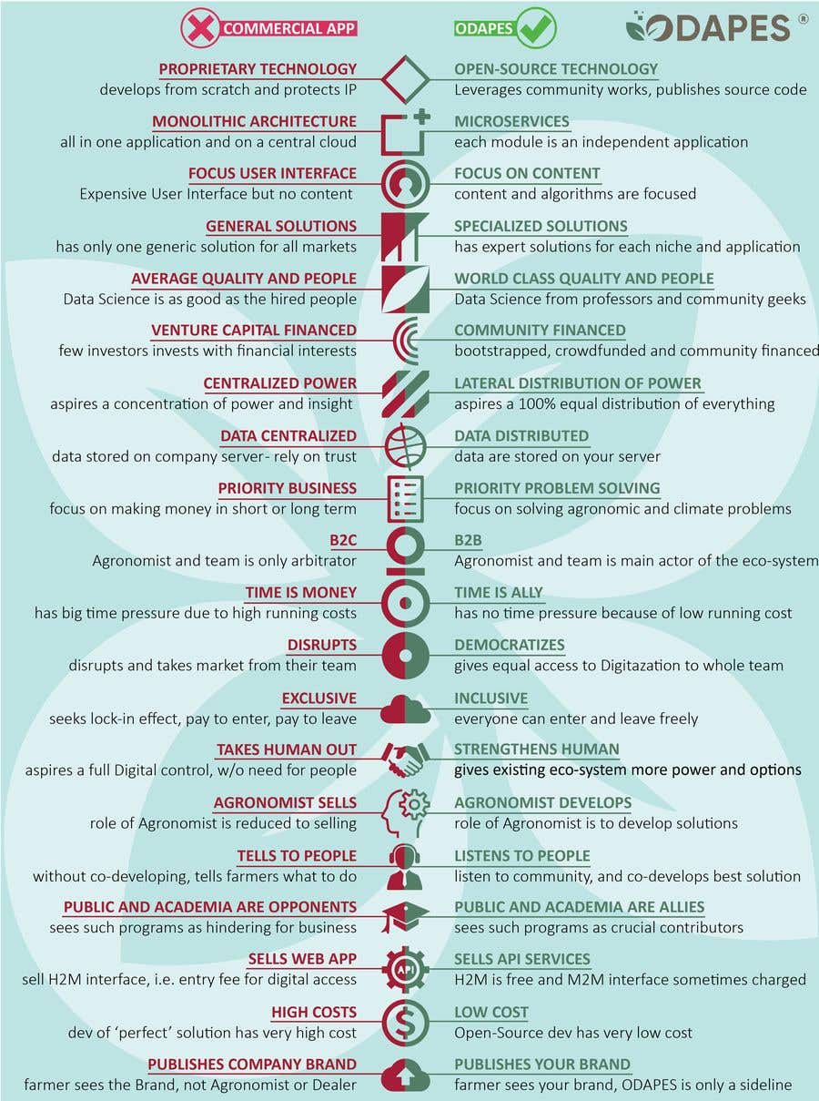
Penyertaan Peraduan #62 untuk                                                 COMPARISION INFORGRAPH FOR DIGITAL AGRICULTURE APP

Papan Penjelasan Umum

  • MichaelRubinSP82
    Penganjur Peraduan
    • 3 tahun yang lalu

    here another feedback. as some more examples come in, i realized that the color combination of Red and Green as main colors I don't like too much. I think the best combination for the main part is the Brown and Green, the same as in our Logo. Red, purple and blue should only be helper colors for some special things. thanks

    • 3 tahun yang lalu
  • MichaelRubinSP82
    Penganjur Peraduan
    • 3 tahun yang lalu

    i really like your approach. here are some details, which i would consider:
    1. I would change some of the symbols - categories. each symbol has a meaning and it would be cool of it matches. i can give you input on that

    2. maybe i would clear the red and green cross respective tick for commercial app and odapes in the header. instead, you can just use the odapes logo on the right side and some form of 'commercial app' on the left side.

    3. I like the logo in the background. But i am not 100% happy with the color of it. somehow it' not matching with the CD. Maybe you have some different ideas, using our colors, transparency etc...i leave it to your creativity.

    • 3 tahun yang lalu
    1. itsatiflatif
      itsatiflatif
      • 3 tahun yang lalu

      I am really thankful to you, please guide me for symbols,
      I have started working.

      • 3 tahun yang lalu
  • MichaelRubinSP82
    Penganjur Peraduan
    • 3 tahun yang lalu

    but your're on the right way.

    • 3 tahun yang lalu