Design a Logo for Action 4 Balance Coaching practice

  • Status: Closed
  • Hadiah: $70
  • Penyertaan Diterima: 34
  • Pemenang: mariusfechete

Ringkasan Peraduan

Hi!
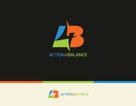
My name is Lidia and I have a request for a logo for a wellness coaching company. We are a group of coaches that want to put our skills in common for the people that need coaching and training to reach balance in their lives. We work with different tools to help our clients be more healthy on all dimensions: mental, physical, emotional, social and spiritual. Our concept is called ACTION 4 BALANCE.
Ideas:
- we like the idea of a balance/scale (but not like the Justice one) - create the ideal balance between life and work using wellness & health coaching
- colors: yellow (for sun, active, positive) and blue (serenity, balance) that become green (hope, healthy)
- we would like to use the A4B letters in the logo (but not necessarily), linking them together in a way to express the path we do with our clients from the point A (taking Action) to a point B (towards Balance) that is the wellness they desire
- the subtitle of the logo has to be: Coaching Innovation for Wellness or Action for Balance - still to decide according to the logo
- it has to be simple, clean, innovative, expressing balance and the desire for health and balance in life and work.

Kemahiran Disyorkan

Maklum Balas Majikan

“Great logo, creative idea to combine the letters in the drawing, very good communication skills, availability to modify until we were completely satisfied with the logo. I will ask Marius\'s help again for sure.”

Gambar Profil lidiadogaru, Italy.

Papan Penjelasan Umum

  • lidiadogaru
    Penganjur Peraduan
    • 10 tahun yang lalu

    Everybody, thank you very much for all your proposals! We debated until the very last minute about what logo would be best for us and we finally took a decision. It was hard… :) If any of the proposals that are high rated on our list would like user feedback, please let us know. Thanks again!

    • 10 tahun yang lalu
    1. lidiadogaru
      Penganjur Peraduan
      • 10 tahun yang lalu

      hi Legol2s. We did discuss also on your entry no 84 a lot :) We liked it as it had the element of balance but the a and b where a bit crowded into the 4 and it did not make understandable the logo for others (we do know what it's there, but it's not very visible for the eye of someone that just saw it). Beautiful, calm colors. Thank you!

      • 10 tahun yang lalu
    2. legol2s
      legol2s
      • 10 tahun yang lalu

      Thanks) Good luck with the branding of your company!

      • 10 tahun yang lalu
  • leandroulloa
    leandroulloa
    • 10 tahun yang lalu

    PLEASE TAKE A LOOK #116

    • 10 tahun yang lalu
  • sayed82
    sayed82
    • 10 tahun yang lalu

    Please check #113.

    • 10 tahun yang lalu
  • Syahriza
    Syahriza
    • 10 tahun yang lalu

    Hello Dear CH, I've post my design at #108 #107. Thank you :)

    • 10 tahun yang lalu
  • mariusfechete
    mariusfechete
    • 10 tahun yang lalu

    I came up with a new concept. Please check it and let me know what you think. Thank you

    #101 #102

    • 10 tahun yang lalu
  • luciacrin
    luciacrin
    • 10 tahun yang lalu

    New design #95 and #96. Please feedback. Of course they can all be done in any color variation. Thanks.

    • 10 tahun yang lalu
  • luciacrin
    luciacrin
    • 10 tahun yang lalu

    How about #78 and #79? thanks!

    • 10 tahun yang lalu
    1. luciacrin
      luciacrin
      • 10 tahun yang lalu

      also #85. any feedback would be good!

      • 10 tahun yang lalu
  • veenaldsilva
    veenaldsilva
    • 10 tahun yang lalu

    hi can i get a feedback for #62

    • 10 tahun yang lalu
  • mohit247
    mohit247
    • 10 tahun yang lalu

    Please review n rate #76...........thanks

    • 10 tahun yang lalu
  • vijaymahale101
    vijaymahale101
    • 10 tahun yang lalu

    Please check #68 and #69 .. Thanks :)

    • 10 tahun yang lalu
    1. lidiadogaru
      Penganjur Peraduan
      • 10 tahun yang lalu

      Hi! Thank you for your proposals. I love the colors, but the lines are too thin. You cannot view well the letters or the balance.

      • 10 tahun yang lalu
  • lidiadogaru
    Penganjur Peraduan
    • 10 tahun yang lalu

    Don't go for the rigidity…we do appreciate curves and pleasant lines.

    • 10 tahun yang lalu
  • lidiadogaru
    Penganjur Peraduan
    • 10 tahun yang lalu

    Hi all! Thank you very much for all your proposals! I know it's only one day left and I would appreciate if you would come with a fresh logo, that would also include the concept of balance in it. The A4B seems a bit rigid from most of the proposals that we got… Thanks again!

    • 10 tahun yang lalu
    1. mohit247
      mohit247
      • 10 tahun yang lalu

      Please review n rate #71...........thanks

      • 10 tahun yang lalu
    2. lidiadogaru
      Penganjur Peraduan
      • 10 tahun yang lalu

      Mohit247, it's very rigid from my point of view.

      • 10 tahun yang lalu
  • pipra99
    pipra99
    • 10 tahun yang lalu

    What you think about #48

    • 10 tahun yang lalu
  • kingcainoy
    kingcainoy
    • 10 tahun yang lalu

    well describe for logo wanted it reflect to the first entry was great. I hope all contest holder would describe like this one. thank you very much.

    • 10 tahun yang lalu

Tunjukkan lebih banyak komen

Bagaimana untuk mulakan dengan peraduan

  • Siarkan peraduan anda

    Siarkan Peraduan Anda Cepat dan mudah

  • Dapatkan berjuta penyertaan

    Dapatkan Bertan-tan Penyertaan Dari serata dunia

  • Anugerahkan penyertaan terbaik

    Anugerahkan penyertaan terbaik Muat turun fail - Mudah!

Siarkan Peraduan Sekarang atau Sertai kami Hari Ini!