Papan Penjelasan Umum

  • NimaM89
    Penganjur Peraduan
    • 5 tahun yang lalu

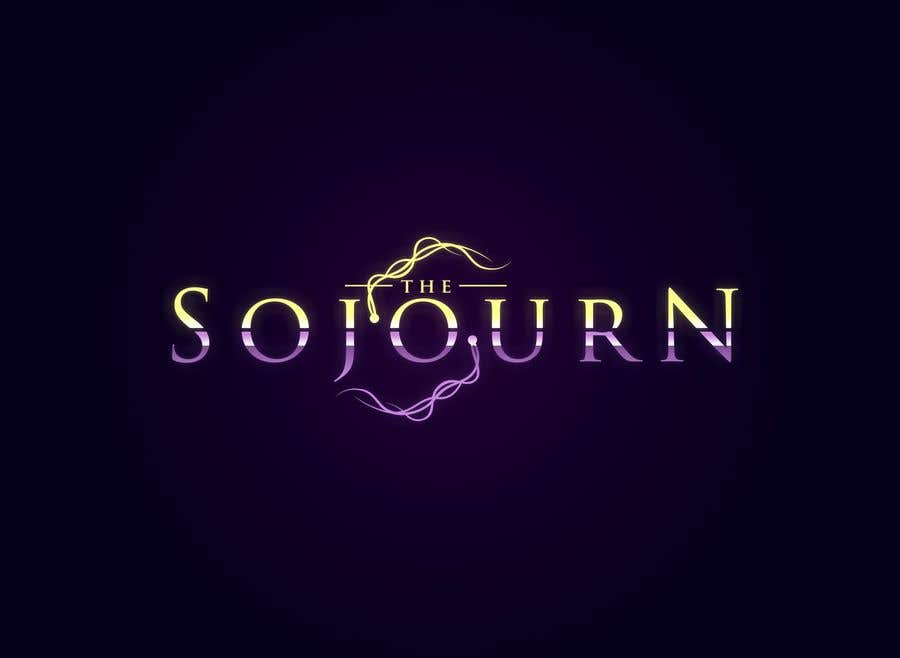
    ow and btw try to keep the gold parts as good side. it works

    • 5 tahun yang lalu
  • NimaM89
    Penganjur Peraduan
    • 5 tahun yang lalu

    i think thicker would be worst. you can give it a try but I think the you should take more time to make the font more unique, but not thicker :)

    • 5 tahun yang lalu
  • NimaM89
    Penganjur Peraduan
    • 5 tahun yang lalu

    ow additionally try to look at the game from far away and too close. they should both be nice

    • 5 tahun yang lalu
    1. reyryu19
      reyryu19
      • 5 tahun yang lalu

      Thank you for your feedback sir. How about using a thicker font? and purple color replaced with blue color?

      • 5 tahun yang lalu
  • NimaM89
    Penganjur Peraduan
    • 5 tahun yang lalu

    I personally like spirits, but try to work on them a bit more. whenever u felt like it. but REALLY nice start man.

    • 5 tahun yang lalu
  • NimaM89
    Penganjur Peraduan
    • 5 tahun yang lalu

    FINALLY :) someone paid attention. thanks man. its far from being perfect in my opinion. but it has nice ideas in it. the colors are a little bit dull for a game logo, and although u tried to make 2 worlds in side the logo, they don't give that vibe much. maybe you can emphasis on that a bit more. its a hard design to go with, since this purple is too girly and cute. but you cant really use simple black, cuz the font wont be visible in dark background.

    • 5 tahun yang lalu

Tunjukkan lebih banyak komen Sedang diproses...