Design a Logo (CrossFit Norsemen)
- Status: Closed
- Hadiah: $200
- Penyertaan Diterima: 104
- Pemenang: bacujkov


Ringkasan Peraduan
CrossFit Norsemen is a new CrossFit gym opening up in 2017. We require a logo that both suits our name and ethos of fitness and community.
Attached you will find a ‘mood board’ full of words, photos and graphics that should serve as some inspiration. We want a logo that is memorable, stunning, extremely well designed and suitable for use across all design mediums (web, social media, print, large signage and even embroidery). There are a list of definite things we don’t want to see below.
· No horned helmets
· No pig tail hair cuts
· No barbells
· No Abbreviations (CFN)
· No shadows
· No gradients
· No long shadow flat designs
The logo must include a graphic logo, the words ‘CrossFit Norsemen’ in lower title case as I have written it (note the capitalised F in CrossFit) or alternatively, all in upper case “CROSSFIT NORSEMEN”.
The logo must include the tag line of “Brothers. Sisters. Forged by Fitness” either in title case or uppercase.
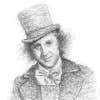
We like the idea of the face of a man/king/warrior with a beard and helmet/face armour. We like black and white but will defiantly consider black and white designs that also use an accent colour.
The free font found here: https://www.behance.net/gallery/15536975/Norse-free-font would be desirable but other fonts will be considered.
The logo must be designed in vector format (ai or svg). Graphics will be checked so please ensure that anchor points and lines are not messy, fonts are named and layers are properly organised and labelled.
Lastly, we understand that stock vectors might be utilised but please don’t try and pass off stock images as your own work as I have access to all major stock libraries. If you use stock vectors please disclose this and show us how you have manipulated the original graphic.
We are open minded and invite all ideas. Open for seven days... please don't rush, we won't end the contest early. Good luck!
Kemahiran Disyorkan
Maklum Balas Majikan
“Excellent freelancer, great communication skills, totally understood the brief and was more than willing to make changes when requested. Looking forward to working with her again soon. Five stars! ”
![]() pauldean48, Australia.
pauldean48, Australia.
Papan Penjelasan Umum
-
Penganjur Peraduan - 7 tahun yang lalu
Winner to be picked tonight, sorry for delay folks.
- 7 tahun yang lalu
-

marvinbaldemor36
- 7 tahun yang lalu
okay sir! We will be waiting
- 7 tahun yang lalu
-

freelancerMilena
- 7 tahun yang lalu
thank you too. I learned a lot from you. I hope you liked my work. I hope to work with you again. please, invite me to your competition, without obligation but to me with great pleasure. you're also likeable and cute. I hope you can choose me for this contest. my picture setting was inspired by Vienna, the early twentieth century. greetings from Italy. a kiss, milena
- 7 tahun yang lalu
-
Penganjur Peraduan - 7 tahun yang lalu
Thanks to all designers that submitted entries. A winner will be picked Saturday afternoon (Australia).
- 7 tahun yang lalu
-

lobsanggg
- 7 tahun yang lalu
#162 pls
- 7 tahun yang lalu
-
OlexandroDesign
- 7 tahun yang lalu
Soon i will send you my work please wait!!!!!!!
- 7 tahun yang lalu
-

ratstudio
- 7 tahun yang lalu
Please check #157
- 7 tahun yang lalu
-
marvinbaldemor36
- 7 tahun yang lalu
kindly check #156
- 7 tahun yang lalu
-

DavidBoyati
- 7 tahun yang lalu
Please check #153 , #154 , #155 , Thank you.
- 7 tahun yang lalu
-

incubu666
- 7 tahun yang lalu
Please check #152
- 7 tahun yang lalu
-
lobsanggg
- 7 tahun yang lalu
#137 pls
- 7 tahun yang lalu
-
marvinbaldemor36
- 7 tahun yang lalu
kindly check #136
- 7 tahun yang lalu
-
marvinbaldemor36
- 7 tahun yang lalu
Please check #128 thanks!
- 7 tahun yang lalu
-
marvinbaldemor36
- 7 tahun yang lalu
Kindly check #125 thanks!
- 7 tahun yang lalu
-

Muktishah
- 7 tahun yang lalu
Sir, please check Entry #121 and let me know. Thanks in advance.
- 7 tahun yang lalu
-
marvinbaldemor36
- 7 tahun yang lalu
kindly check #119. thanks!
- 7 tahun yang lalu
-
lobsanggg
- 7 tahun yang lalu
#111 pls
- 7 tahun yang lalu
-
DavidBoyati
- 7 tahun yang lalu
Please check My New entry. Thank you.
- 7 tahun yang lalu
-
DavidBoyati
- 7 tahun yang lalu
Please check #85 , #86 , Thank you.
- 7 tahun yang lalu
-
Penganjur Peraduan - 7 tahun yang lalu
Entries #75 through to #78 unfortunately those shapes are not working well.
- 7 tahun yang lalu
-
Darusalam
- 7 tahun yang lalu
Logo on sketch proccess
- 7 tahun yang lalu
-
Penganjur Peraduan - 7 tahun yang lalu
Ok, bacujkov and marvinbaldemore36 You both have good entries. Please remember that there are still four days left and I promise that we will not award winner until that seven days has expired. Please do go back through all the feedback I have given and keep coming up with new variations but please don't rush your design. Thanks, Paul.
- 7 tahun yang lalu
-
marvinbaldemor36
- 7 tahun yang lalu
okay sir! thank you for the feedback and help you did. I really appreciate all of it. I'll be working on more variations. Thanks again sir!
- 7 tahun yang lalu
-
Penganjur Peraduan - 7 tahun yang lalu
marvinbaldemor36 Entries #58 #55 #63 so entry 55 has the best shape but can you stretch the tag line across the top like in 58, once that is done I would like to see experimentation with different fonts for the word "CROSSFIT". But 55 is the best and that is the one you should concentrate on. Thumbs up.
- 7 tahun yang lalu
-
marvinbaldemor36
- 7 tahun yang lalu
Thanks for the feedback sir! I'll be working on it now!
- 7 tahun yang lalu
-
Penganjur Peraduan - 7 tahun yang lalu
Entries #50 and #60 Maybe the edge of the shield is now too complex? Also can you remove the inner circle and maybe a knot pattern on the horizontal part of the helmet that is somewhere between the two? Great designs through.
- 7 tahun yang lalu
-
Penganjur Peraduan - 7 tahun yang lalu
Entry #58 well done. Can we see this work without the grunge mask and also, can you please experiment with different fonts for the word "CROSSFIT". Looking forward to seeing how this one develops.
- 7 tahun yang lalu
-
marvinbaldemor36
- 7 tahun yang lalu
okay sir! Right away! thank you again for the feedback!
- 7 tahun yang lalu
-
Penganjur Peraduan - 7 tahun yang lalu
*** Attention all Freelancers *** I have uploaded a vector file of my own work. This is our logo at the moment. We really like the face of the man on this logo and we like that it's not an elongated logo, we also like the roughened edges. Please feel free to open this file and use any element you like to come up with new ideas or add to your own.
- 7 tahun yang lalu
-
Penganjur Peraduan - 7 tahun yang lalu
Entry #57 well done, best design yet! Can't fault it too much other than to say the overall concept is great so don't change that (man, round shield and the style and placement of the lettering). I would like to see what it looks like with the dragons replaced with something else or maybe have them looking a little more like like the ones from bow of a viking boat? The only other thing I would say is maybe the Celtic pattern on the horizontal part of the helmet is too complex for a logo design... could you make this a little bit more simplified? Love you're work!
- 7 tahun yang lalu
-
Penganjur Peraduan - 7 tahun yang lalu
Entries #54 and #55 . Good job. These are good designs. Can you carry on and explore the same design but with variations. The overall concept is great for both, maybe the axes are a little bit too fearsome? I would like to see the shield design with cleaner lines and maybe a less complex Celtic knot?
- 7 tahun yang lalu
-
marvinbaldemor36
- 7 tahun yang lalu
okay sir! thank you very much for the feedback! I'll work on the changes.
- 7 tahun yang lalu
-
Penganjur Peraduan - 7 tahun yang lalu
Entries #46 and #49 the celtic knots are good, the kettlebell is good but maybe try with different fonts, the tag lines looks like it doesn't belong as part of the logo and I think the axes need to be a little less fearsome?
- 7 tahun yang lalu
-
marvinbaldemor36
- 7 tahun yang lalu
Okay sir! thank you for the feedback! I'll be working on it.
- 7 tahun yang lalu
-
Penganjur Peraduan - 7 tahun yang lalu
Entry #50 . Nice try but we won't ask you to do any more on that design as it's just not working.
- 7 tahun yang lalu
-
Penganjur Peraduan - 7 tahun yang lalu
Entry #44 like it. Best entry so far. Can you make the word CROSSFIT more fitted to the billowing sail and also I would like to see the centre of the boat be an actual boat with the word NORSEMEN kind of blended into the wooden planks of the side of the boat? Maybe replace the celtic knot with a kettlebell? You're doing a good job.
- 7 tahun yang lalu
-
marvinbaldemor36
- 7 tahun yang lalu
Okay sir! thanks! I'll do everything you requested!
- 7 tahun yang lalu
-
marvinbaldemor36
- 7 tahun yang lalu
Kindly check #47 for the applied changes. thank you!
- 7 tahun yang lalu
-
Penganjur Peraduan - 7 tahun yang lalu
Enrty #40 . I like the logo but the words an the sword look awkward next to it. Can you try and re-work those elements and see what you come up with?
- 7 tahun yang lalu
-
Penganjur Peraduan - 7 tahun yang lalu
Thanks for new entries. Entry #41 so too roman... we are looking for a Norse style logo. Entries #37 and #38 nice work... can we see some more variations using different knots and maybe different ways in which the text is displayed like in a circle around the graphic and maybe different fonts and colours?
- 7 tahun yang lalu
-
marvinbaldemor36
- 7 tahun yang lalu
Okay! Thank you for the feedback! Very much appreciated!
- 7 tahun yang lalu
-
Penganjur Peraduan - 7 tahun yang lalu
Thanks for new entries. Entry #41 so too roman... we are looking for a Norse style logo. Entries #37 and #38 nice work... can we see some more variations using different knots and maybe different ways in which the text is displayed like in a circle around the graphic and maybe different fonts and colours?
- 7 tahun yang lalu
-
Penganjur Peraduan - 7 tahun yang lalu
Overall, it seems like nobody is really reading and understanding the brief, studying the mood board and coming up with original designs which is disappointing. All these designs are just stock vectors, where is the original thought guys? Where is the symbolism of Norse culture? Where is the Celtic knots? This is a guaranteed 200 bucks!!!
- 7 tahun yang lalu
-
Penganjur Peraduan - 7 tahun yang lalu
Entry #36 getting there although he kind of looks like a sleepy old man now?
- 7 tahun yang lalu
-
Penganjur Peraduan - 7 tahun yang lalu
Thanks for the new entries. Feedback for #23 - it's ok, it still just looks like two stock vectors place on top of one another. Entry #24 I like the basic lines but not the wings on the helmet and the text just placed next to the logo looks awkward. Entry #25 looks like a Japanese samurai with horns.. please read the brief again. Entry #34 again, that's a Roman Spartan helmet.
- 7 tahun yang lalu
-
marvinbaldemor36
- 7 tahun yang lalu
kindly check #23 and give your feedback if you liked it. thanks!
- 7 tahun yang lalu
-
maktdesign
- 7 tahun yang lalu
Entry #34
- 7 tahun yang lalu
-

chyonislam
- 7 tahun yang lalu
Font is really Don`t match in this logo thanks
- 7 tahun yang lalu
-
Penganjur Peraduan - 7 tahun yang lalu
You don't have to use that font... it's just a suggestion.
- 7 tahun yang lalu
-
Penganjur Peraduan - 7 tahun yang lalu
Entry #16 thank you. We like the face and beard but not the crown. Please consider replacing crown and continuing that design with something else.
- 7 tahun yang lalu
Bagaimana untuk mulakan dengan peraduan
-

Siarkan Peraduan Anda Cepat dan mudah
-

Dapatkan Bertan-tan Penyertaan Dari serata dunia
-

Anugerahkan penyertaan terbaik Muat turun fail - Mudah!