Freelancer: sumitsinghthakur
Kongsi:
Laporkan Entri

Please review

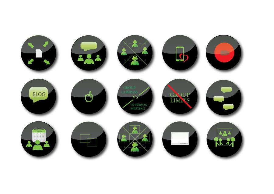
I have gone through shared icons, The flat shadow was not looking good as we are using multiple items in our design. removing border was looking very flat so gave glossy effect, please give feedback
Penyertaan Peraduan #14 untuk                                                 Design some Icons for website

Papan Penjelasan Umum

  • sumitsinghthakur
    sumitsinghthakur
    • 9 tahun yang lalu

    See #20 , thanks

    • 9 tahun yang lalu
  • sumitsinghthakur
    sumitsinghthakur
    • 9 tahun yang lalu

    Working on it.

    • 9 tahun yang lalu
  • Nathann15
    Penganjur Peraduan
    • 9 tahun yang lalu

    This is awesome. Can you provide another version with alternate grey shadowing you have on icon and one without any grey shadowing at all? Leave the the gloss though. It really makes the icons pop. Very awesome. Can you add an ipad type symbol to go behind phone (you can make it look nice and remove heart). Please switch out video symbol with similar colors (green) to the rest of the icons.

    • 9 tahun yang lalu