Logo designs for garden/water saving

  • Status: Closed
  • Hadiah: $90
  • Penyertaan Diterima: 8
  • Pemenang: sdugin

Ringkasan Peraduan

I have two logo sets that I need designed

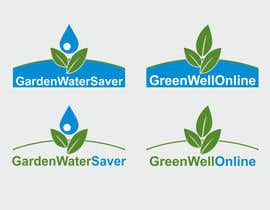
#1 = GardenWaterSaver is website that provide information and products related to saving water, both in commercial landscaping and in the home garden. Its target audience is landscape wholesalers, commercial landscapers, gardening shops and the general public.

#2 = Greenwell is a water saving device designed to assist trees and other plants grow well. By concentrating water and fertilizers to the roots of the tree or plant. Its target audience is landscape wholesalers, commercial landscapers, gardening shops and the general public. It is available on the GardenWaterSaver website.

#1 text = GardenWaterSaver
#2 text = GreenWellonline (Greenwell the focus of the logo, it can be similar to the current Greenwell logo attached, but I believe the font needs to be sharper and modernised.)

Colors
I think the colors in the attached will be good color swatches, but happy for you to deviate if you think it is needed
GardenWaterSaver : Green/Dark Blue/Aqua/White
Greenwellonline : Dark Green/Aqua or Blue/White
Colour swatches see attached images

Details
Would like square and leader board sytle (for use on web and print, stationary such as letter heads)
Vector images, should be a logo suitable to resizing
Would like transparent copies of each set
Will need Photoshop/PSD files, aswell as jpeg/gifs for web.

Refinements (please see attachments)

Fonts for all logos
would like something a little different to Arial, maybe PT Sans or Droid Sans.

GreenWell
I have circled the ones I would like to proceed with.
1a : Can you do a version where the aqua stops before the GreenwellOnline text, and then put GreenwellOnline in dark green
1b : All good, just need another version that has .com.au added.
1c : Instead of the "online" in blue, can you please change color to a grey/charcoal and put "online" on a second line after "GreenWell". Will then need another similar one that has : GreenWellOnline.com.au fit neatly over two lines.


GardenWaterSaver
I have circled the ones I would like to proceed with.
1a : Can you do a version where the aqua stops before the GardenWaterSaver text, and then put GardenWaterSaver in dark green
1b : All good, just need another version that has .com.au added.
lc : make droplet solid colour. Will then need another similar one that has com.au added, maybe on a second line

Extra
.com.au does not need to be prominent, simply visible
In need transparent copies of each logo as well as version with no white space border
The files formats you have been providing have been good, I gather due to the eps they will scale up or down well and be edited in creative suite or photoshop?

Kemahiran Disyorkan

Maklum Balas Majikan

“Freelancer made a number of edits and overall I was happy, communication could have been better but I am a first time user, the fault probably lies with me as much as anyone. Happy with the result overall, and that\'s the main thing.”

Gambar Profil nomisgee, Australia.

Papan Penjelasan Umum

  • nomisgee
    Penganjur Peraduan
    • 10 tahun yang lalu

    #25 the dark green you are using on the right logo, is a good colour for the "GreenWell" logo set, maybe online should be in the blue aqua you have chosen

    The droplet over a the plant is working well for "GardenWaterSaving". Would like to see variants with the logo to the left and the text to the right. Something that would act as a header on a website

    • 10 tahun yang lalu
    1. sdugin
      sdugin
      • 10 tahun yang lalu

      Do all the options.

      • 10 tahun yang lalu
  • ibed05
    ibed05
    • 10 tahun yang lalu

    please check #35 .

    • 10 tahun yang lalu
  • ibed05
    ibed05
    • 10 tahun yang lalu

    thanks and regards.

    • 10 tahun yang lalu
  • nomisgee
    Penganjur Peraduan
    • 10 tahun yang lalu

    #24 please don't use black background, its best for me to look at white or transparent backgrounds. The font for "saver is hard to read

    • 10 tahun yang lalu
    1. juanluis21
      juanluis21
      • 10 tahun yang lalu

      Ok sir! I will fix that =)

      • 10 tahun yang lalu
  • nomisgee
    Penganjur Peraduan
    • 10 tahun yang lalu

    The "GreenWellonline" logo set may not need a logo, but would be interested in ideas you may have.

    • 10 tahun yang lalu
  • juanluis21
    juanluis21
    • 10 tahun yang lalu

    #20 I was made a mistake with the word garden! If you like my logo please feedback and I will fix that. Sorry and thank you =)

    • 10 tahun yang lalu
  • manishrai22
    manishrai22
    • 10 tahun yang lalu

    rate #18

    • 10 tahun yang lalu
  • vladspataroiu
    vladspataroiu
    • 10 tahun yang lalu

    Hello, I took the liberty to write you a PM, you can view it by clicking on my name. Thank you.

    • 10 tahun yang lalu
  • nomisgee
    Penganjur Peraduan
    • 10 tahun yang lalu

    sdugin, hendy2004, rilographics. Really like the water over the plant/vegetation logo's you are putting together.

    Have liked the fonts styles used by sdugin, they are easy to read even when images are quite small.

    For the GreenWell logo set, the text for "Greenwell" should be a darker green, similar to the current logo. http://www.greenwellwatersavers.com/img/greenwell_logo.gif The product itself, most popular colors is dark green : http://www.greenwellwatersavers.com/img/large_greenwell_pic.jpg

    Interested in seeing both square logo sets (such as sdugin #15 ) and logo sets that would suit the header of a website.

    Thanks everyone so far, some really good logos coming through.

    • 10 tahun yang lalu
  • Dragoljub
    Dragoljub
    • 10 tahun yang lalu

    updated #2

    • 10 tahun yang lalu
    1. Dragoljub
      Dragoljub
      • 10 tahun yang lalu

      misstype here, sorry... feel free to reject #1 and #2 , #3 is final.. thanks

      • 10 tahun yang lalu
  • nomisgee
    Penganjur Peraduan
    • 10 tahun yang lalu

    Thanks dragoljub, the white/transparent version is the preferred. font/layout feels a bit dated

    • 10 tahun yang lalu
    1. Dragoljub
      Dragoljub
      • 10 tahun yang lalu

      it's my pleasure...original file is layered psd, so if if you choose me as contest winner I'll provide you with that 300dpi psd in which all is needed is to turn of background layer and save file as png or gif (png for better quality but still transparent)

      • 10 tahun yang lalu

Tunjukkan lebih banyak komen

Bagaimana untuk mulakan dengan peraduan

  • Siarkan peraduan anda

    Siarkan Peraduan Anda Cepat dan mudah

  • Dapatkan berjuta penyertaan

    Dapatkan Bertan-tan Penyertaan Dari serata dunia

  • Anugerahkan penyertaan terbaik

    Anugerahkan penyertaan terbaik Muat turun fail - Mudah!

Siarkan Peraduan Sekarang atau Sertai kami Hari Ini!